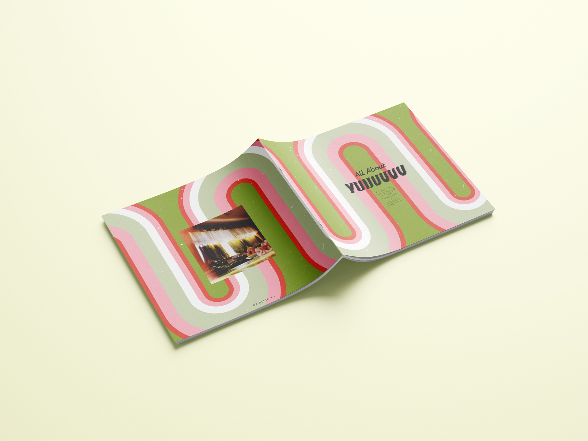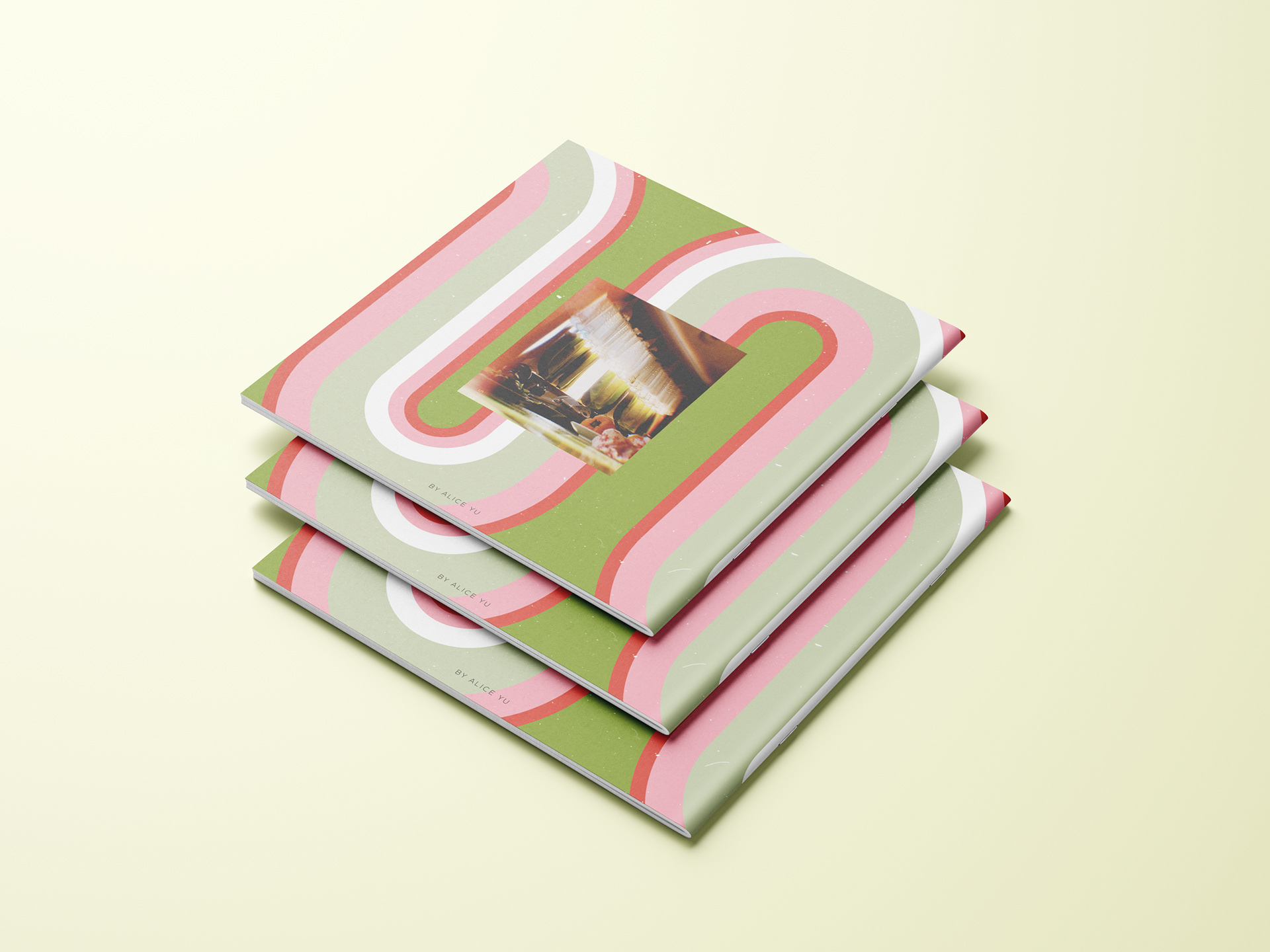
Objective
(3rd Year University Project)
To create an object that reflects what I've learnt during the first semester of 2020 at University and adjusting to online learning due to COVID 19. I've chosen the theme of a food related theme because this related to a studio I was in at the time.
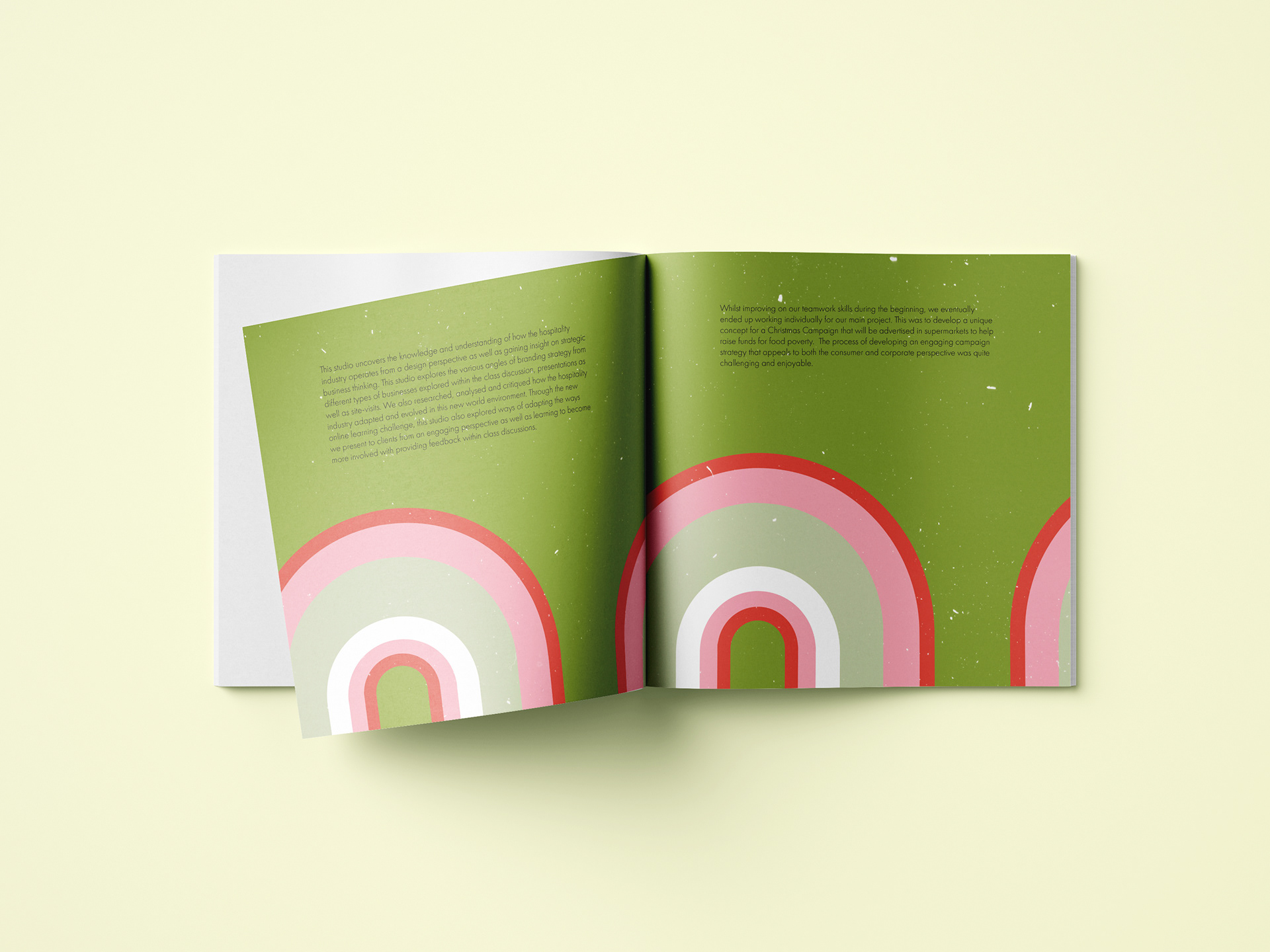
Analysis
(All photographs of food were arranged and photographed by me as well)
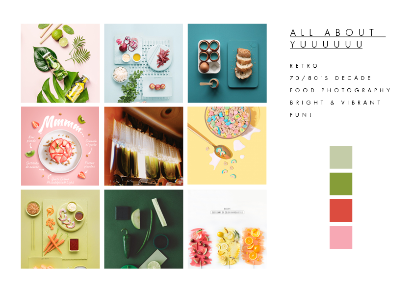
Having spent the majority of my time at home, with no more visits to café’s or restaurants, I was forced to turn my kitchen into a mini café. This gave me the idea of creating a mini cookbook/zine inspired by my kitchen and developing a suitable brand language. The mini cookbook explores the different types of snacks that I would consume depending on my moods throughout the semester. I decided to focus on snacks since this was more common now than ever, as spending more time at home allowed the freedom for me to eat whenever I wanted.
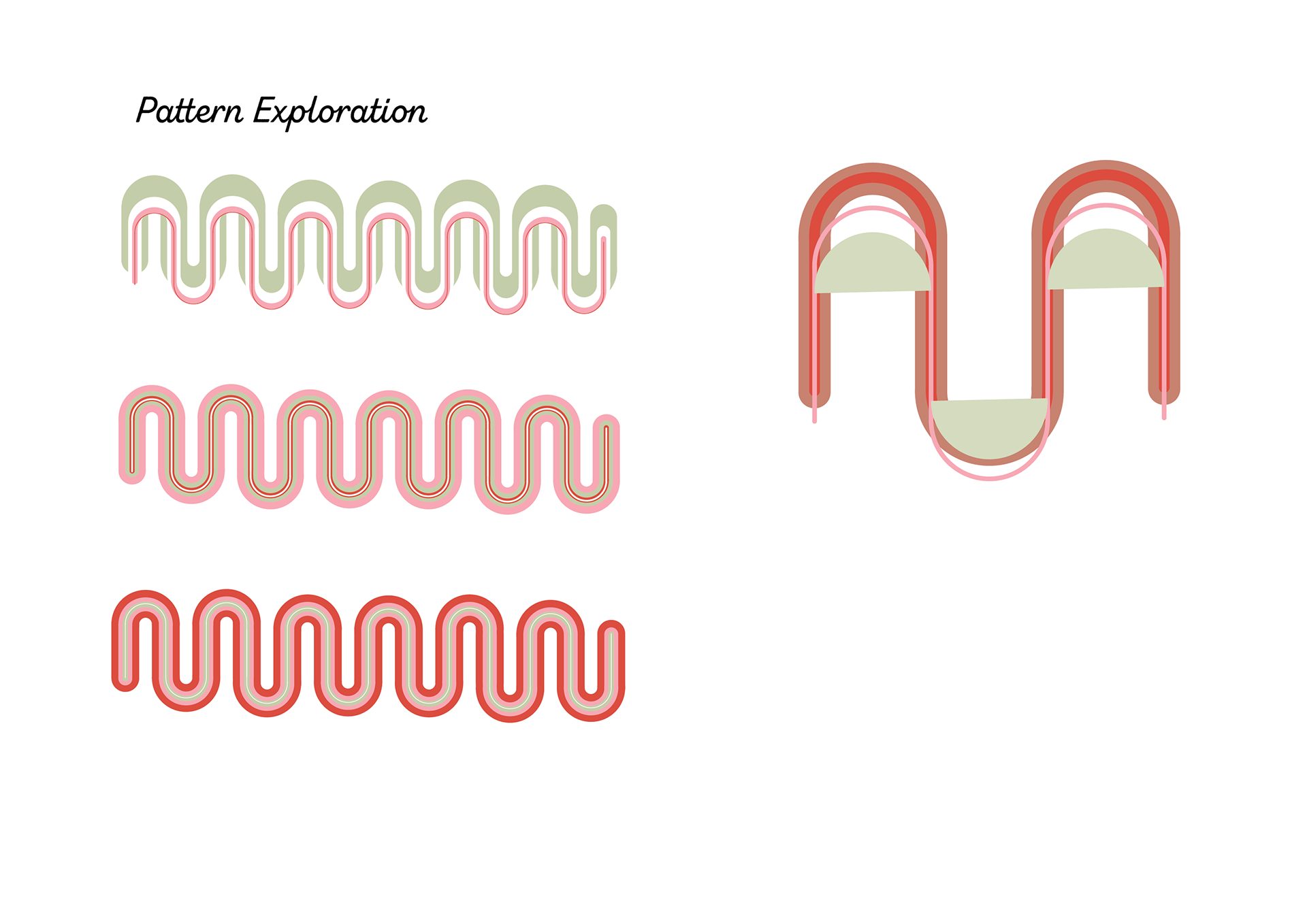
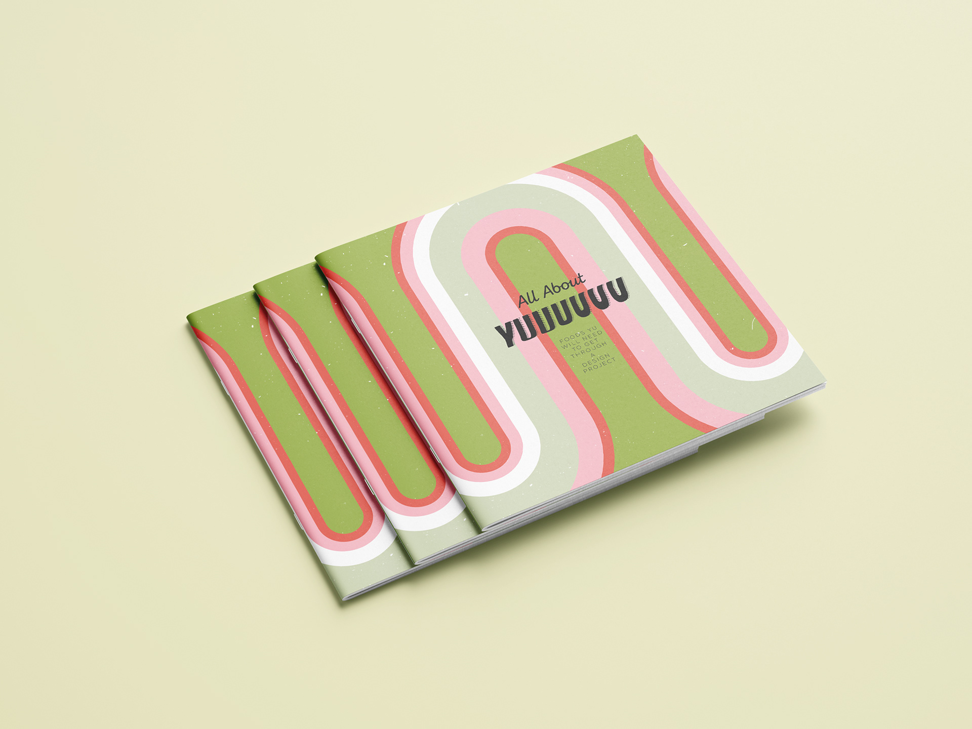
My kitchen hasn’t been renovated since around the 70’s-80’s, hence the retro aesthetic that I went for in my design. The colours and pattern design are inspired from my kitchen curtains and the mini scratch marks of the cover design not only enhance a vintage look, but also represent the very literal scratches that exist on our main kitchen counter.
The plating of the foods represents the emotions of each stage and the choices of the foods accompany each mood as well.
Process & Development

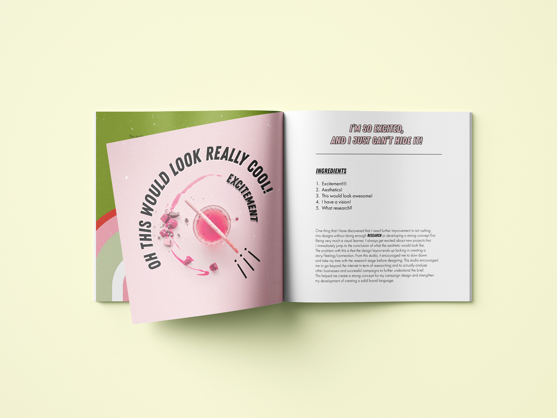
Pink represents excitement, which is most of the time generally an emotion I would get at the start or near the end of a project. Hence I used foods that I would save for special occasions to snack on. Also the plating it a bit more towards the high tea/5 star restaurant quality aesthetic to reflect the notion of anticipation. As in this stage I also talk about slowing down and not rushing into my designs, I’ve used a fancy teacup with rose lemonade tea to symbolise the idea of “tea breaks”. So taking some time off to think and research before designing.
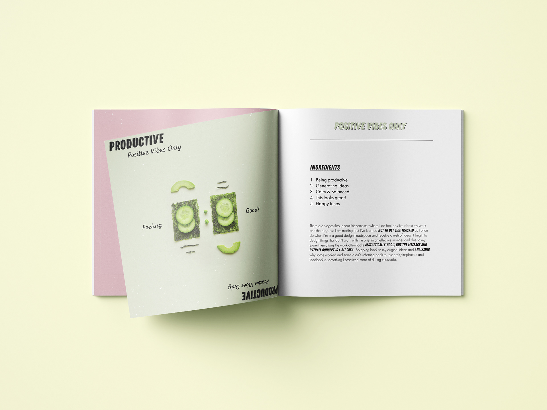
Green represents a sense of feeling happy and positive, so therefore I’m more likely to eat healthier and exercise more. The plating is more balanced and symmetrical, paired with healthy snacks to resemble my emotions.
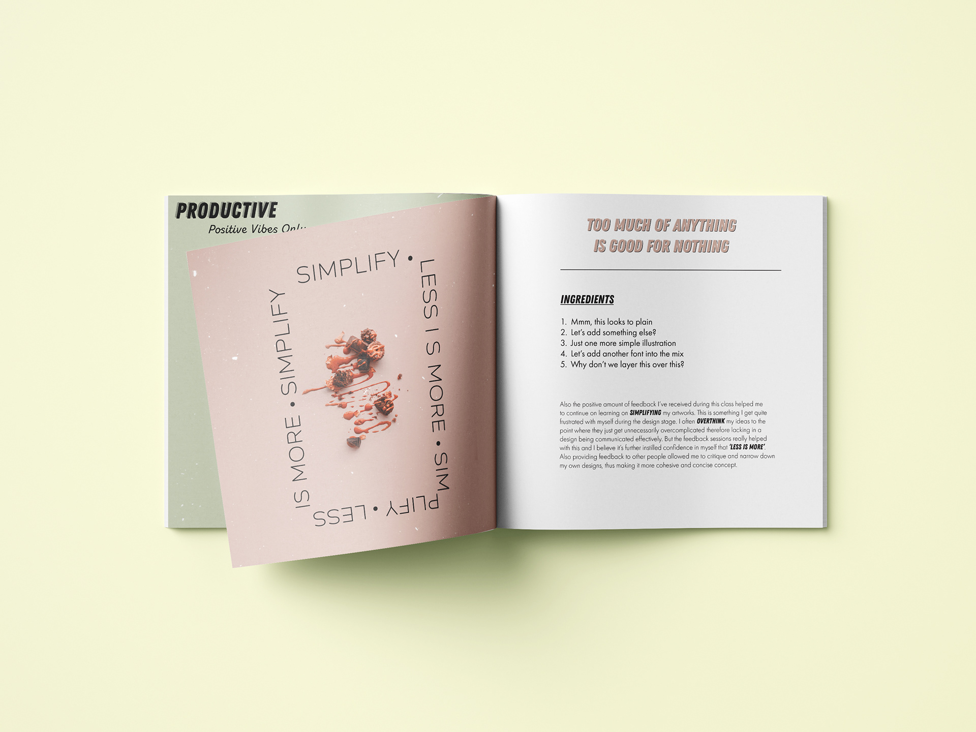
Brown represents the stages I go through when I overdesign something. I’ve used chocolate and coffee as the main snack ingredient as it is something that resembles the idea of how when you have too much, it often leaves you feeling nauseous.
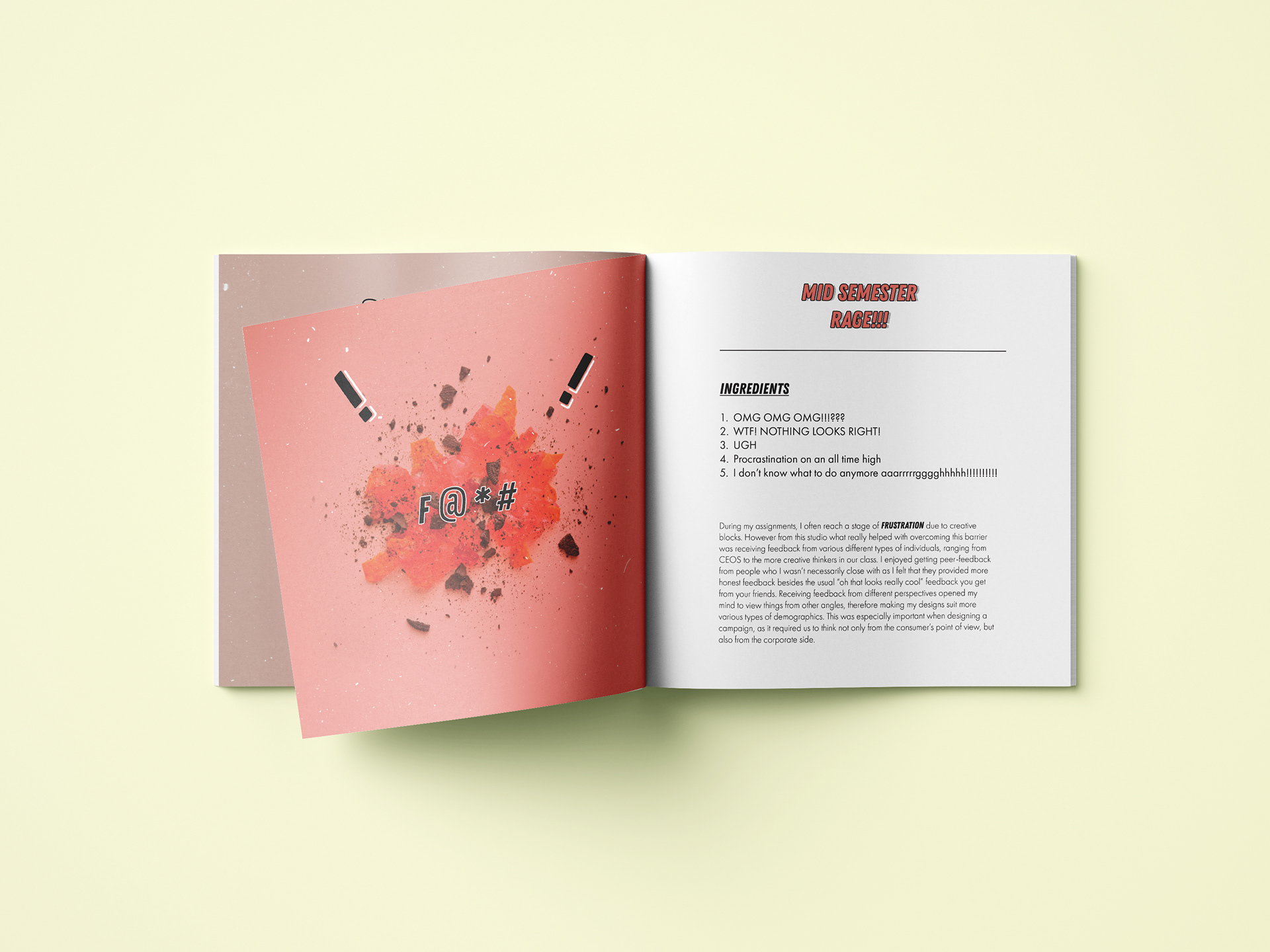
Red represents a stage of depression and anger, therefore leading me to eat more snacks with a higher content in sodium’s and fats and sugars to make me feel temporarily better. One of the main ingredient being jelly, as it represents the fragility of my mental state.