Objective
(Hypothetical Project)
To give a fresh new look and to create extra promotional material
Analysis
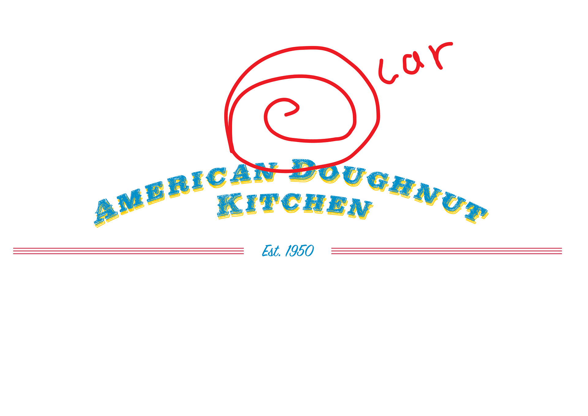
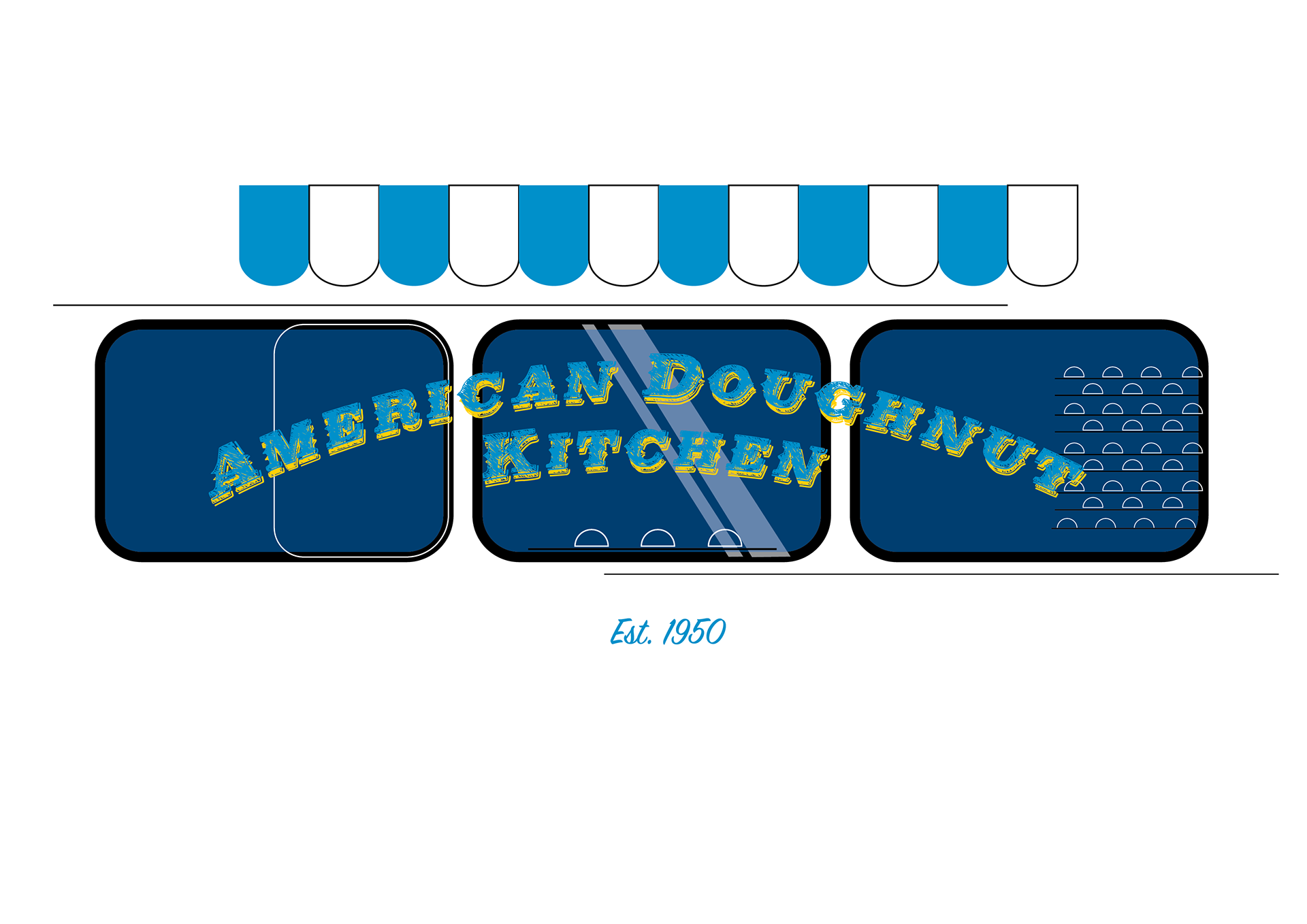
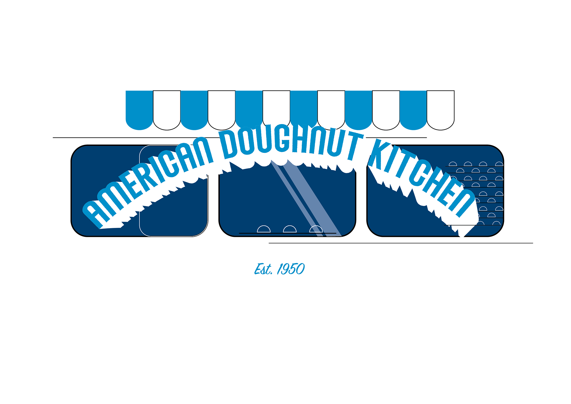
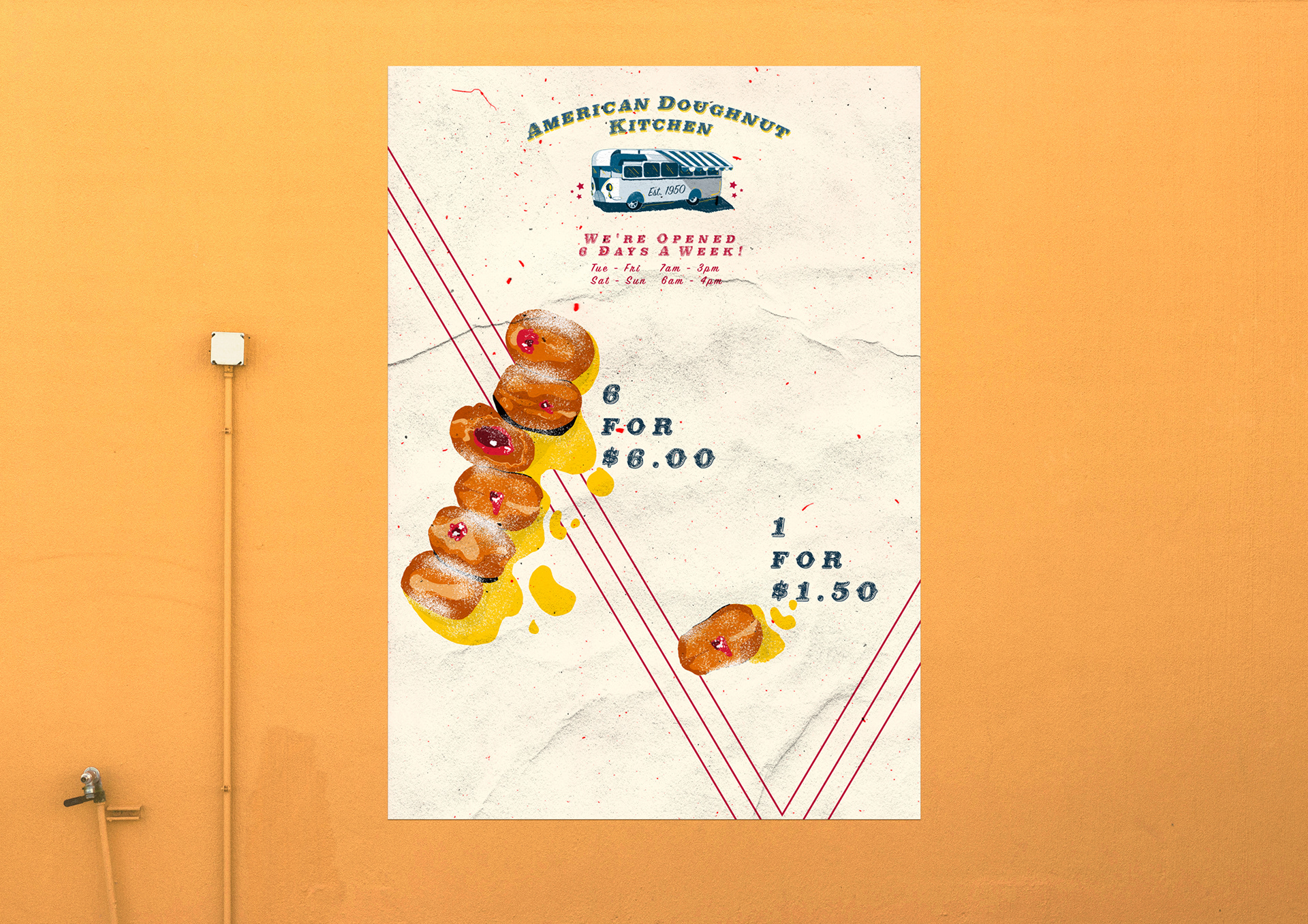
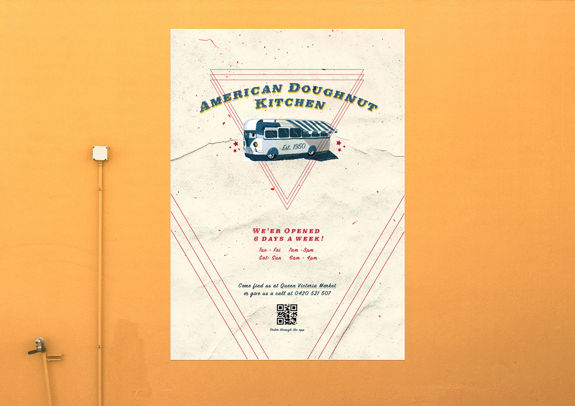
For the logo I chose a font quite similar to their original one simply because it suited this vintage aesthetic, but it also worked well with Queen Victoria Market font. The font also consists of a hand drawn aesthetic, which complements how they produce their doughnuts, which are handmade with dedication and care.
I've hand drawn the van, not only to compliment the font, but also since it is a core visual element that is associated with the business and represents the classic streat food we all have come to admire.
The colour palette of the blue and red symbolises the american flag colours, whilst creating contrast. The yellow and pastel pink enhances a vintage aesthetic.
The triangular lines create a more interesting effect that symbolises a retro american diner aesthetic
Process & Development


I've chosen a simple recyclable paper bag. This suits their fast paced environment, and is low in budget
I also designed an alternative look to their packaging if they were a doughnut shop that was more towards the expensive category. This was fun to create and to see how the logo could be applied to a higher end product as well as a lower end product, but still maintaining that vintage quality and effect that represents the business.
