Objective
(3rd Year University Project)
To develop a packaging design of your choice, with the focus on brand identity and associated collateral
Analysis
Seven Rays is an Organic Tisane Tea product, created through the magical forces of nature to enlighten your dreary mornings or to cast a spell over those troublesome headaches. There are Seven different flavours, catering to all unique tastebuds and desires, with the option to brew your own wicked concoction. Made from fresh ingredients sourced from our local farmers right here in mainland Australia.
Whilst many turn to caffeinated/energy drinks to deal with the stress of balancing university life with life in general, I mostly spent about 80% of my time drinking tea to calm my nerves. Thus, this is what inspired me to develop a tea product and brand identity that caterers to a younger generation. I aimed to provide a healthier alternative to caffeinated/energy drinks that also incorporated my ongoing interest about the wonders of the natural world. The term “seven rays” refers to the combination of the seven forces in nature, which therefore brings everything into existence. Each of the rays is believed to be associated with a different kind of occult energy, planet, chakra, colour and principle.
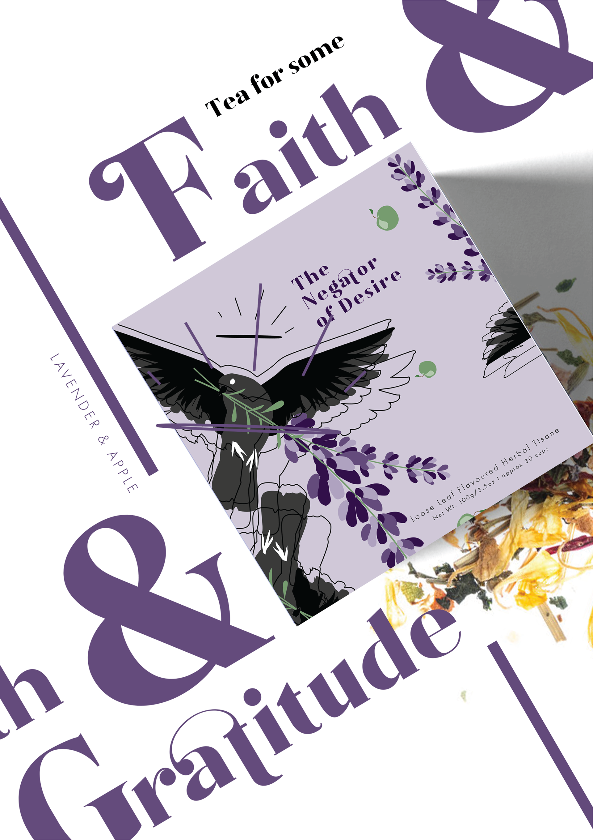
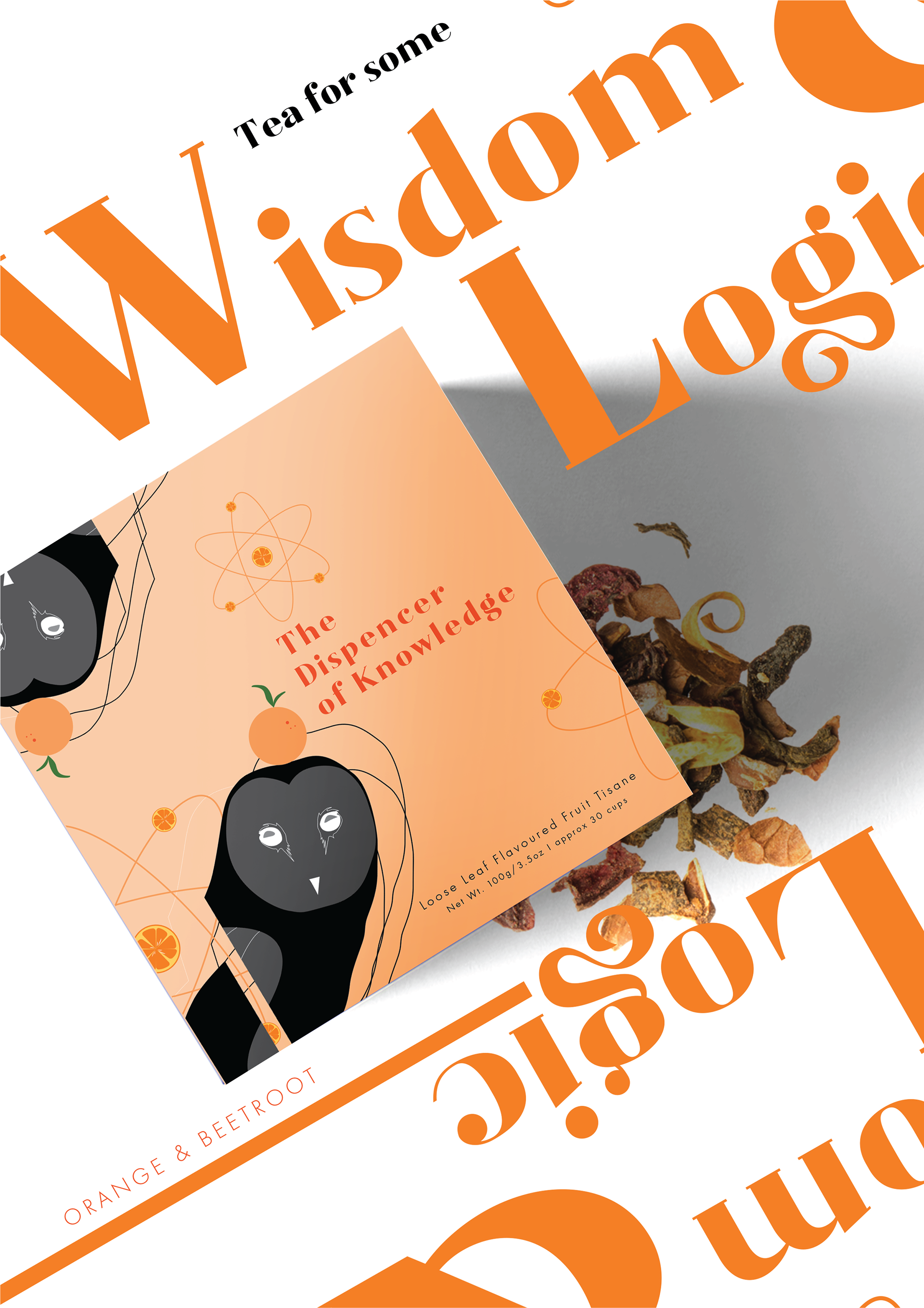
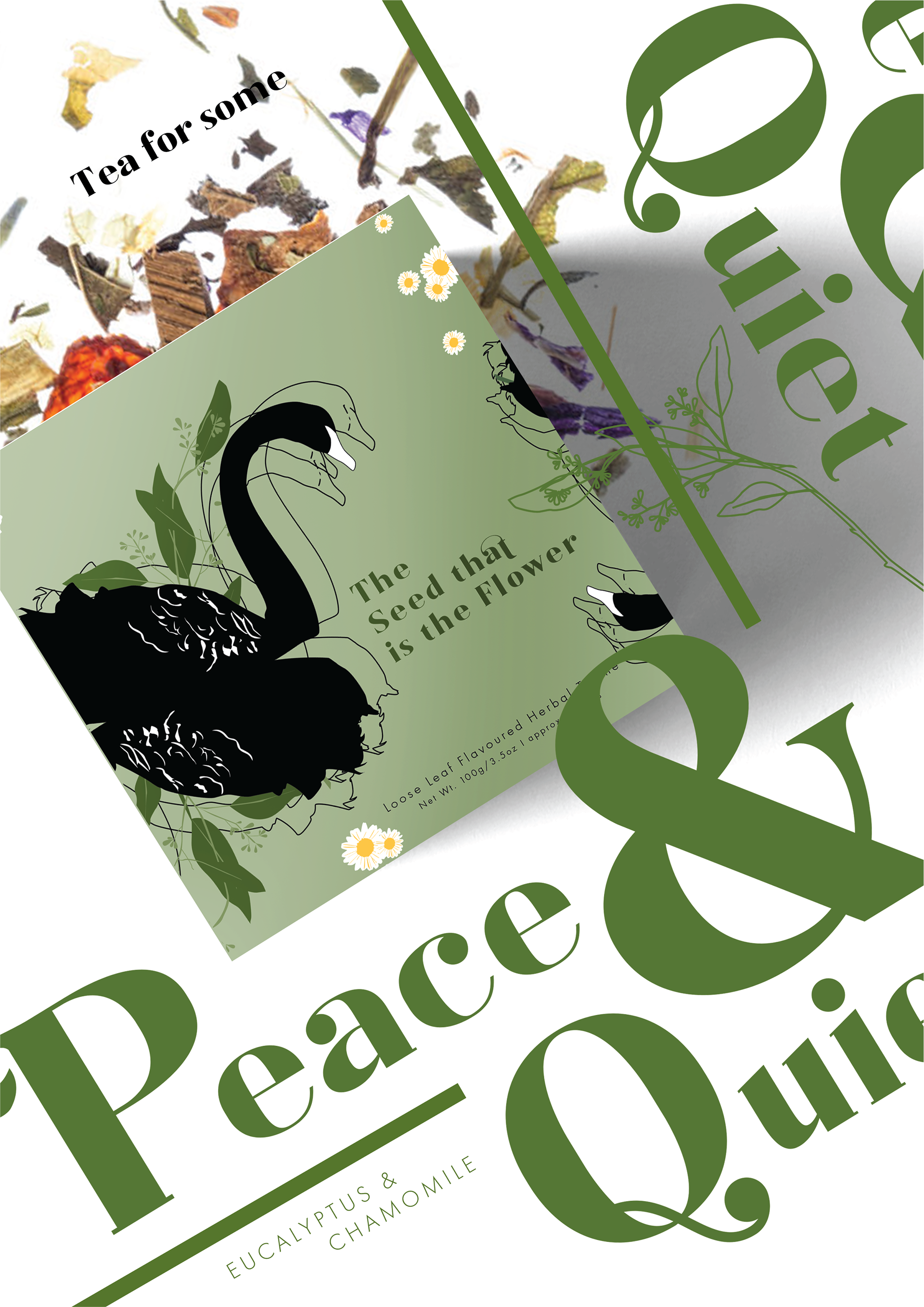
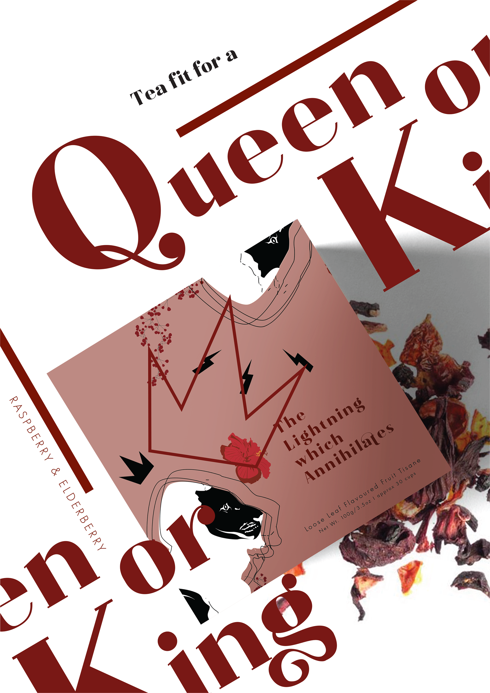
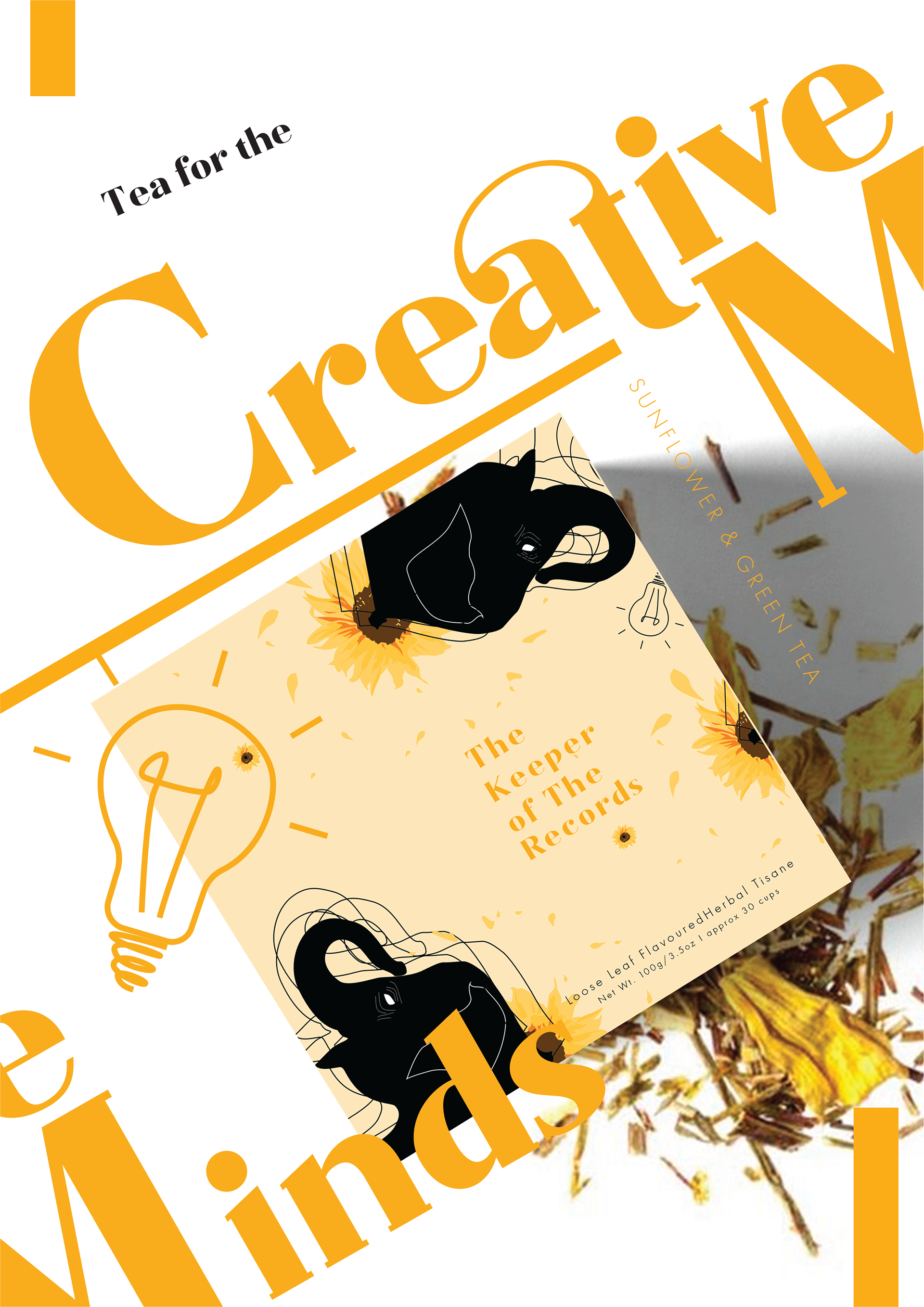
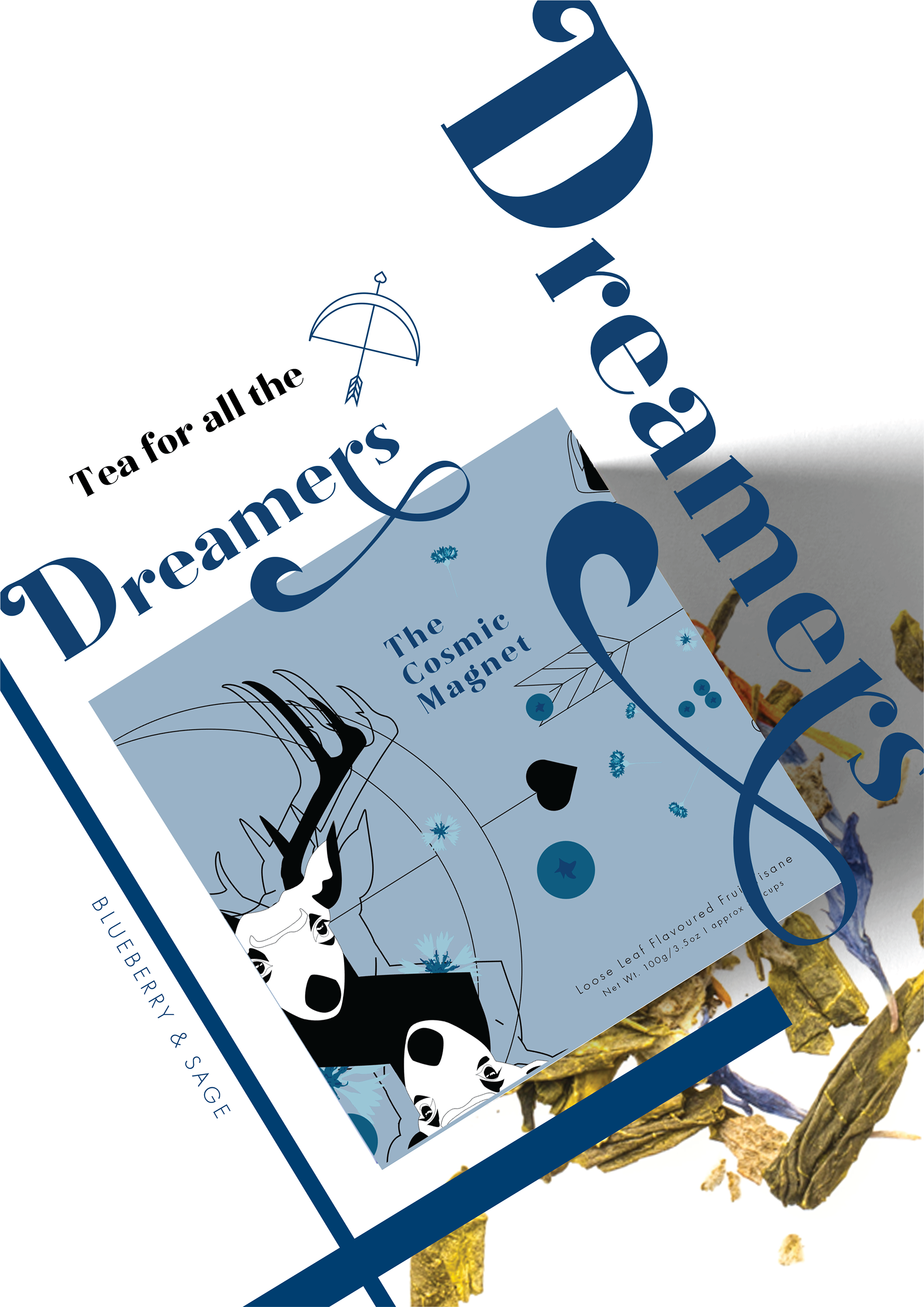
This project aimed to encompass the seven unique ray qualities within each package design, through the use of animals to symbolise a particular trait of each ray, as well as bold colours and symbols.
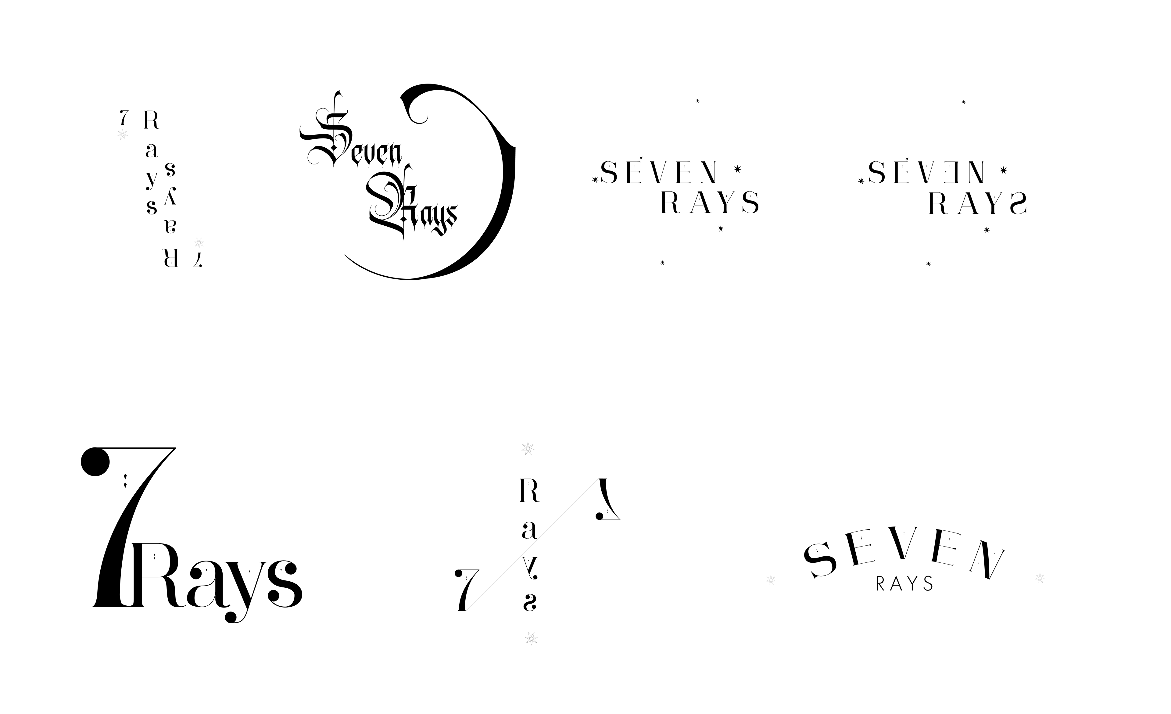
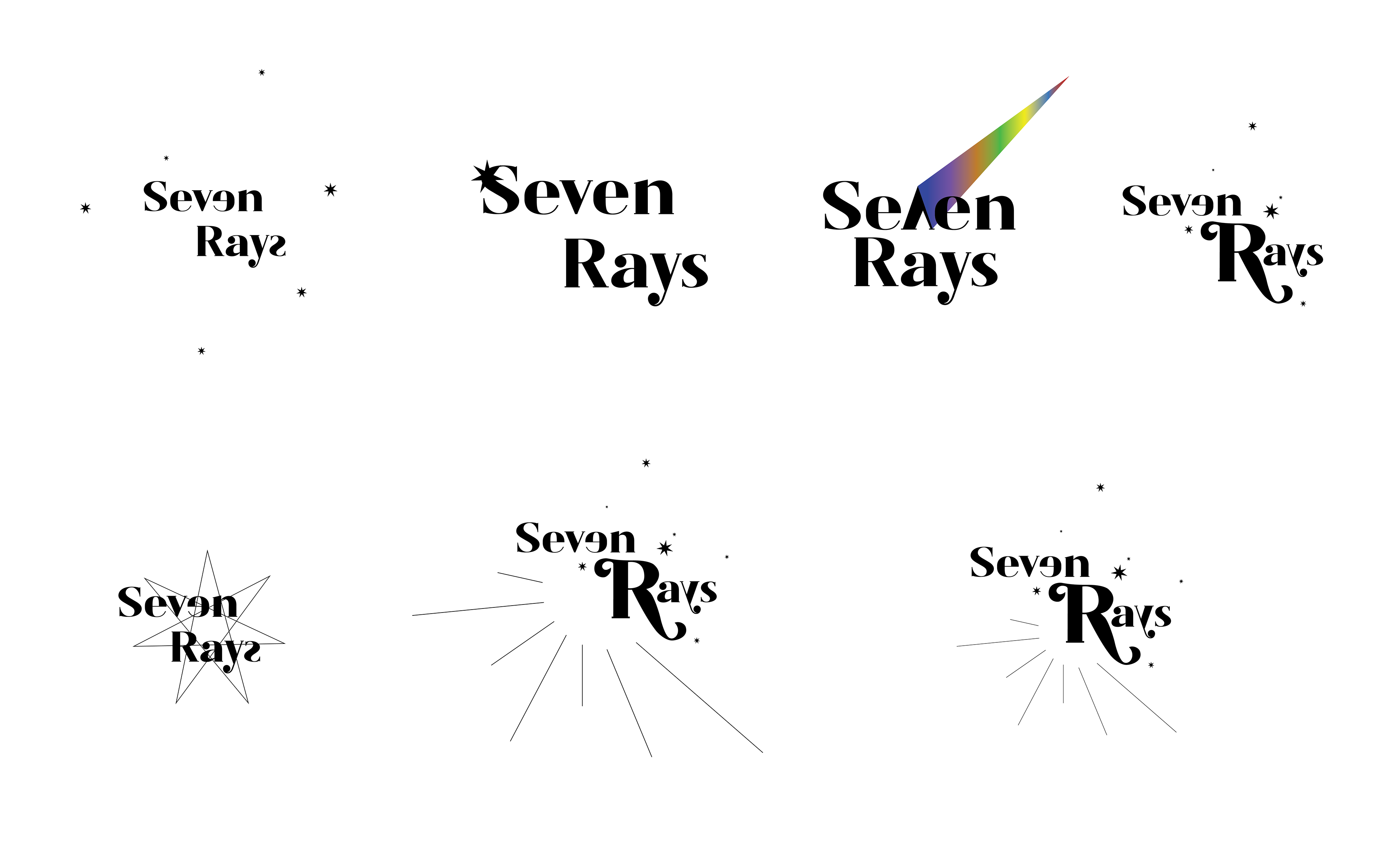
The logo represents a fun and contemporary aesthetic due to typographic usage. The use of colours further creates an edgy and vibrant aesthetic that aligns with the graphic designs. The use of lines creates the notion of sunlight, whilst the stars resemble the night sky. This contrast of light and dark showcases the idea of how the tea can be consumed throughout any time of the day. The secondary logos are specific to each of the rays, which therefore gives it a more customised result for each box design.
Process & Development
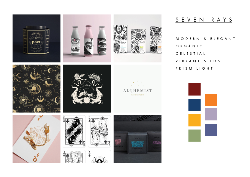
The colours palettes for each box is based on the colour that represents each ray. I’ve chosen earth-based tones to appeal to the organic aesthetic approach in which it corresponds to the product itself. The colours are also quite bright and create a playful aesthetic when placed next to each other.
‘Seven Rays’ also has a “Deluxe” range, which includes all seven tea flavours, as well as a mini booklet which further explores the developmental stages of achieving each flavour. The booklet also explores the different flavour combination users can try at home. The “Deluxe” range is great for presents to give to families and friends.
Poster Designs for Each Project

